2026 Kitchen Color Trends: What Designers Predict Will Replace White
Outline and Why This Matters
The all-white kitchen has been a reliable go-to for years because it feels clean, airy, and resale-friendly. Yet design always evolves, and homeowners are now asking for rooms that feel warmer, more grounded, and easier to maintain. In 2026, color trends reflect that shift: neutrals are not disappearing, but they are softening and gaining depth. This article first lays out an outline of what to expect, then dives into practical guidance for anyone planning a refresh—from a weekend paint upgrade to a full remodel. Along the way, you will find comparisons, lighting notes, material pairings, and maintenance realities that help you make an informed choice.
Here is the roadmap we will follow:
– A quick outline of key topics and why color direction is changing in kitchens
– The single shade designers say will step in for pure white in 2026 and why it works in real homes
– A look at three widely admired kitchen colors and how they compare in mood, maintenance, and resale appeal
– How the new trend shows up in finishes, counters, backsplashes, and hardware—plus tips for natural and low-light rooms
– A practical conclusion with next steps, from sampling to balancing undertones
Why this matters now: materials and lighting have moved toward organic textures—honed stone, tactile tile, brushed metals, and richly grained woods. These surfaces often look more cohesive next to warmer, desaturated hues. There is also a real-world factor: many households want finishes that hide minor wear and daily splashes. Mid-value neutrals can conceal crumbs and fingerprints better than pure white while still delivering a bright, welcoming room. For anyone keeping an eye on return on investment, calmer neutrals typically remain versatile for future buyers without feeling sterile.
Another reason to pay attention is how daylight plays with color. The same cabinet color can read warm beige in morning sun and cooler gray in shaded corners. A trend that acknowledges changing light conditions—rather than fighting them—can help your kitchen feel intentionally designed throughout the day. Expect a movement toward layered, livable palettes that embrace subtle undertones and natural variation, rather than stark, high-contrast minimalism.
The Color Designers Say Will Replace White Kitchens in 2026
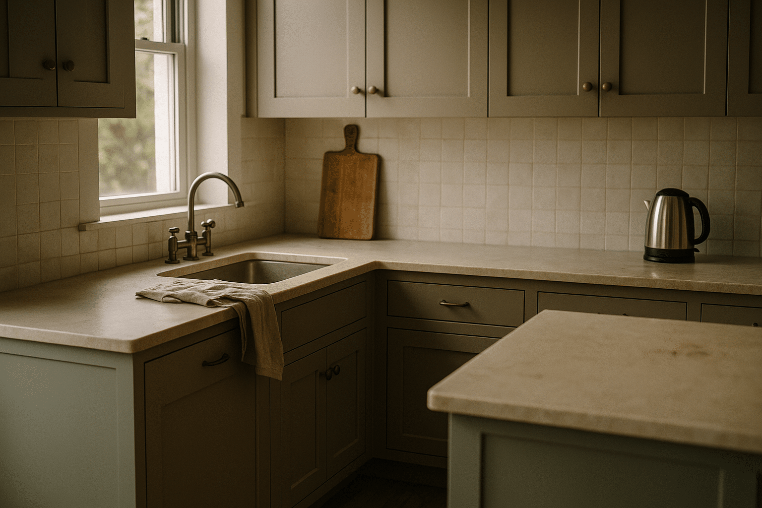
The consensus gathering steam for 2026 points to mushroom taupe as the neutral poised to replace pure white in kitchens. Think of it as a warm gray-beige with a soft brown undertone—neither yellow-beige nor slate gray. Its power lies in balance: it keeps a space light enough for a clean look, but the warmth steadies all the tactile surfaces that contemporary kitchens love. On cabinets, this hue reads sophisticated and calm, especially in a matte or satin finish that minimizes glare and gives doors a modern, furniture-like presence.
Practical reasons are driving its rise. First, mushroom taupe’s mid-range light reflectance (often around the low-to-mid 50s depending on formulation) bounces light gently while resisting the overly clinical effect that some bright whites create. Second, it camouflages fingerprints and cooking splashes better than high-chroma whites, which can turn smudges into the star of the show. Third, it plays well with multiple undertones. Warm woods like oak and walnut feel richer next to it, honed light stone appears creamier rather than cold, and brushed metals—from warm brass to muted stainless—sit comfortably without a jarring shift in temperature.
Design advantages include:
– Versatility with both cool and warm accents; it can lean cozy with terracotta accessories or fresh with soft gray stone
– Compatibility with trend-forward textures such as ribbed tile, plaster-look walls, and rift-cut cabinetry
– Ease of layering: incorporate off-white walls, deeper island tones, and textural textiles without visual conflict
There are guardrails. In heavily shaded or north-facing rooms, a too-muddy taupe can feel heavy. The fix is simple: choose a version with a slightly higher light reflectance, add a lighter backsplash in cream or off-white, and ensure task lighting is warm enough to coax out the hue’s subtle brown-gray balance. Conversely, in sun-splashed spaces, a slightly cooler taupe variant can keep the room from skewing too beige at midday.
In short, mushroom taupe offers the reassurance of a neutral, the warmth people crave, and the practical performance many kitchens need. It supports timeless styling without locking you into a bland or overly minimal look, and it adapts gracefully as you change textiles, stools, or hardware over time.
These Three Popular Kitchen Colors
While mushroom taupe is the headliner for 2026, three hues are consistently winning hearts in showrooms and real homes because they deliver character without sacrificing longevity. Each shade serves a different mood, and the most successful kitchens know how to balance these tones with the right counters, floors, and light levels.
1) Mushroom Taupe (the new anchor)
Mood: Calm, grounded, and quietly upscale. It turns cabinetry into a cohesive backdrop that lets stone veining and wood grain shine. Pairs well with: honed light stone, creamy quartz composites, subtly veined marble-look slabs, and mid-tone to light woods. Hardware: brushed nickel for a cooler direction; warm brass for an elevated glow. Floors: white oak tones pull out the beige side, while pale gray porcelain keeps it modern. Maintenance is friendly: splashes and fingerprints don’t leap out, and satin finishes are forgiving.
2) Muted Sage (nature-leaning accent or full-cabinet choice)
Mood: Restorative and fresh, with a whisper of outdoor calm. This desaturated green loves sunlight and makes plant life, natural fibers, and handmade tile feel at home. Pairs well with: cream or warm off-white walls; butcher block or light stone with subtle tan veining; handmade or zellige-style tile in soft neutrals. Works beautifully for islands, pantry doors, or lower cabinets beneath lighter uppers. Lighting note: in north-facing rooms, choose a sage with a touch of yellow to avoid a cold cast. Maintenance: slightly more revealing than taupe if the hue is very light, but still manageable with a matte or eggshell sheen.
3) Ink Blue-Gray (deep, dramatic counterpoint)
Mood: Sophisticated and tailored, adding depth that makes lighter elements feel brighter by contrast. This color sits between navy and charcoal, offering a saturated anchor for islands or vent hoods. Pairs well with: warm stone with cream or caramel veining; mushroom taupe perimeter cabinets; mixed metals where cooler handles meet warm pendants; and smoked glass or ribbed glass doors. Lighting tip: in smaller kitchens, limit this shade to an island or appliance wall so it reads statement, not overwhelming. Maintenance: darker tones can show dust or flour easily; opt for a washable cabinet paint in a low-sheen finish for easy wipe-downs.
Quick comparison for planning:
– Brightness: taupe (medium), sage (light to medium), blue-gray (dark)
– Undertone: taupe (brown-gray), sage (yellow or gray green), blue-gray (cool with slight inky warmth)
– Mood: taupe (balanced), sage (biophilic), blue-gray (refined contrast)
Used together, these three create a layered palette: taupe cabinets for the main run, sage on the island to invite softness, and ink blue-gray accents on a hutch or the range wall. The result feels tailored yet inviting, with each color playing a clear role.
The New Trend: 2026’s Top Kitchen Color
Beyond a single paint chip, the new trend is a design approach that lets mushroom taupe act as the anchor of a layered, tactile palette. The emphasis is on touchable surfaces and gentle contrast rather than stark black-and-white schemes. That means cabinets in taupe, walls in a slightly lighter off-white, and punctuation points delivered through tile textures, wood tone variation, and stone with subtle movement.
Implementation blueprint:
– Cabinets: mushroom taupe in matte or satin for a soft, furniture-like read
– Walls: warm off-white with a whisper of beige or gray to keep undertones aligned
– Island: muted sage for visual interest, or a deeper taupe two steps down for tone-on-tone depth
– Counters: honed light stone (limestone look, creamy quartz composite, or restrained marble veining) to avoid glare
– Backsplash: handcrafted-look tile in off-white or pale greige; a vertical stack or simple brick pattern keeps it timeless
– Metals: mix gently—brushed nickel for function-heavy zones and warm brass for accent pulls or sconces
– Flooring: mid-tone oak or similar grain that warms the room without darkening it
Lighting and LRV matter. Taupe typically falls in a mid-range light reflectance, which keeps rooms feeling open while cutting down on harsh reflections. In south-facing spaces, it reads especially welcoming, muting overly bright sunshine. In north-facing kitchens, pair taupe cabinets with a creamier wall color and reflective elements, such as a lightly glazed tile, to maintain lift. If your kitchen is window-poor, lean on under-cabinet task lighting with warm bulbs and choose a backsplash a couple of steps lighter than the cabinets.
Texture seals the look. A ribbed or fluted panel on the island, woven counter stools, or a slightly tumbled edge on stone counters adds micro-shadows that make the mid-tone base feel dynamic. Over time, this palette adapts well to seasonal updates: terracotta accessories in autumn, soft coastal linen in summer, or charcoal linen runners for winter. Because everything is grounded in a warm neutral, the whole scheme stays cohesive even as accents rotate.
Longevity is another reason this trend resonates. Neutrals with subtle undertones tend to remain appealing, while a mid-value cabinet color simplifies upkeep. Rather than a color-of-the-year gamble, it is a well-regarded foundation that evolves with small, low-risk updates.
Conclusion and Actionable Steps for Homeowners
For homeowners, renovators, and landlords balancing style, maintenance, and marketability, mushroom taupe offers a reliable path away from stark white without surrendering brightness. It anchors a space while inviting layered textures, natural wood, and quietly elegant stone. Paired with muted sage and an ink blue-gray accent, it forms a palette that feels current yet restrained—inviting today and adaptable tomorrow.
Before you commit, test your palette deliberately. Paint large sample boards and move them around the kitchen morning, noon, and evening. View them against floors and counters you plan to keep. If your existing surfaces lean cool (gray tiles, stainless-heavy layouts), steer taupe slightly cooler. If your floors carry honey or caramel tones, a warmer taupe will read harmonious rather than washed out.
Follow this simple sequence to reduce regret:
– Choose the anchor: mushroom taupe for cabinets in matte or satin
– Set the field: warm off-white walls to control overall brightness
– Add a protagonist: muted sage island or pantry door for gentle color
– Define contrast: ink blue-gray on a feature wall, hutch, or hood
– Calm the surfaces: honed or lightly textured counters and backsplash
– Tune the metals: mix, but keep finishes brushed rather than mirror-polished
– Confirm lighting: warm task lighting and reflective backsplash elements in dim rooms
If resale is a concern within a few years, keep the perimeter taupe and reserve bolder color for changeable zones—an island, stools, a freestanding hutch. This allows quick adjustments later with minimal downtime. If you plan to stay, lean into tactile upgrades such as ribbed tile or paneled islands that give your neutral base a handcrafted feel. Either path benefits from the same principle: a warm, mid-value foundation that flatters the materials kitchens rely on every day. With thoughtful sampling and realistic expectations, the 2026 color direction can make your kitchen both welcoming and enduring.


